In this article we're going to explore some techniques that can be used to create a filling text effect with CSS. Some of these techniques covered in the article are experimental.
I'm going to demonstrate you 3 simple ways to apply this effect:
- 1: With data attributes & content
- 2: With background-clip
- 3: With clip rect
With data attributes & content
To create this effect first we need to add the needed html markup.
<p data-text="loading">loading</p>
data-* attributes allow us to store extra information on standard, semantic HTML elements without polluting the class name.
So the styles for the above markup will be:
            p {
              display: inline-block;
              position: relative;
              color: red;
              font-size: 60px;

              &:before {
                content: attr(data-text);
                position: absolute;
                overflow: hidden;
                white-space: nowrap;
                width: 0;
                color: blue;
                animation: fill 2s infinite;
              }
            }

            @keyframes fill {
                50%   { width: 100%; }
                100% { width: 0%;     }
            }
The explanation is simple, we place the overlapping text in before pseudo-element content property via data attribute. Then we need to place the pseudo element upon the 'p' tag and set it's width to 0px. Overflow hidden ensure us that nothing it's going to overlap the original content and white-space no wrap that text won't wrap in a new line. Finally an animation set the width back to 100% so it can fill the pseudo element and fake the filling effect.
In our example we set the width from 0% to 100% and back to 0% so we set the pick at 50%.With background clip
This is an experimental solution based on webkit only browsers. Background-clip is a css property that allows backgrounds specified on elements to clip to the text content of the element.
So the styles will be:
            p {
            display: inline-block;
            font-size: 60px;
            background: url('image.jpg') no-repeat;
            -webkit-background-clip: text;
            color: rgba(255, 255, 255, 0);
            text-shadow: 0 0 rgba(0, 0, 0, .1);
            background-size: 0 100%;
            animation: fill 2s infinite;
            }

            @keyframes fill {
                50%   { background-size: 100% 100%; }
                100% { background-size: 0 100%;        }
            }
The main trick is to set the background clip property to text. Then we need to ensure that the default text is going to be visible, that's why we apply a trasparent color via rgba and set a text-shadow to fill the 'empty' state of the text. Finally the animation set the background-size of x axis from 0% back to 100% to create the filling effect. Notice that this method can only work with background images and not with plain colors.
With clip rect
To create this text filling effect with clip we first need to understand how clip rect works.
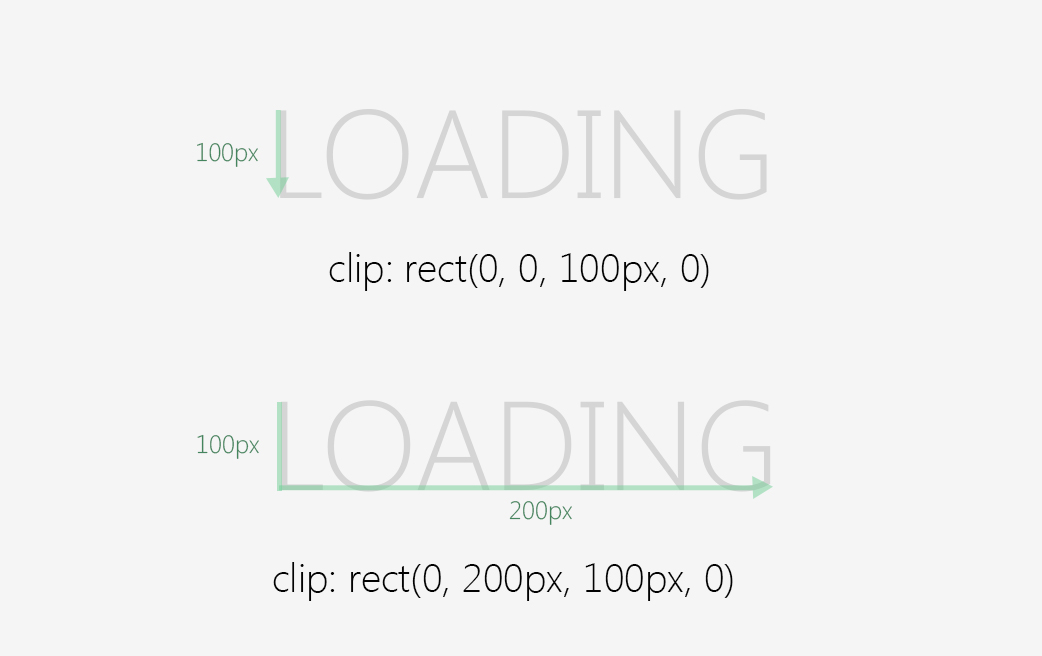
To begin with, clip only works with position fixed or absolute. The clip property apart from auto and inherit accept a shape value, rect in our use case. Clip requires four length values, separated by commas: top, right, bottom and left. As for padding or margin shorthands, it’s clockwise. The strange part is how these values really work. Let's dig in.
Both the top and the bottom values define the offset from the top border and the left and right values define the offset from the left border. It's strange I know but this is how clip works. So let's go back to our example and explain it. Our markup will be the same as the first example (we are going to store the overlaping value in a data attribute)
<p data-text="loading">loading</p>
Our styles for the above markup will be:
            p {
              font-size: 60px;
              position: relative;
              color: red;
              display: inline-block;

              &:before {
                content: attr(data-text);
                position: absolute;
                color: blue;
                clip: rect(0, 0, 100px, 0);
                animation: fill 2s infinite;
              }
            }

            @keyframes fill {
                50%    { clip: rect(0, 200px, 100px, 0); }
                100%  { clip: rect(0, 0, 100px, 0);        }
            }
Clip rect is our magic property here. Our default value is clip: rect(0, 0, 100px, 0) this means that we set a height on the before pseudo element of 100px (the height of text) from the top and a zero width. Now when we apply the animation our clip value is clip: rect(0, 200px, 100px, 0) which means that we expand the right value for 200px from the left side. The following image explains that better.

Let's sum up the above solutions and present them in the following pen, enjoy!
Tweet