21 OCT 2015
Some weeks ago after a morning browsing on weekly digests and blogs I came across a great project from Jlong "css-spinners".
The idea was as simle as that: "Simple CSS spinners and throbbers made with CSS and minimal HTML markup". The minimal markup indicates the usage of one and only element - Now it's challenging! Let's start.
The idea
I struggled to find out a cool shape to animate, like a star or a polygon, but then I decided to start with something simpler. A pixelated cube was a good start so I conclude on a 3x3 cube table.
I decided to use the power of box shadow to create my shape since project allows one and only element (pseudo before and after sadly are not enough). Firstly I had to create the base box markup.
<div class="pixel-loader" >animation...</div>
And the styles accordingly:
            .pixel-loader {
              width: 10px;
              height: 10px;
              background: #333;
              color: #333;
            }
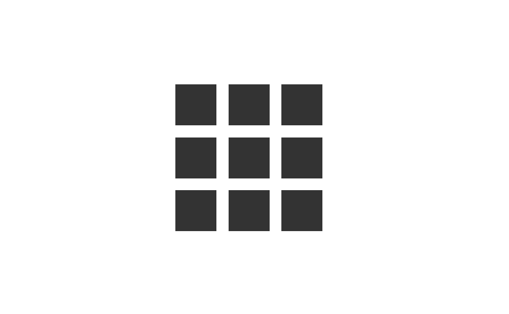
So this is what we have right now:

Stating the obvious here :), now let's create some more boxes with box shadow. For better understanding about how box-shadow property works have a look at the following example:
            .pixel-loader {
              box-shadow: [horizontal offset] [vertical offset] [blur radius] [optional spread radius] [color];
            }
So in our example:
            .pixel-loader {
              width: 10px;
              height: 10px;
              background: #333;
              color: #333;
              box-shadow: 0 15px 0 0,
                                  15px 0 0 0,
                                  -15px 0 0 0,
                                  0 -15px 0 0;
            }
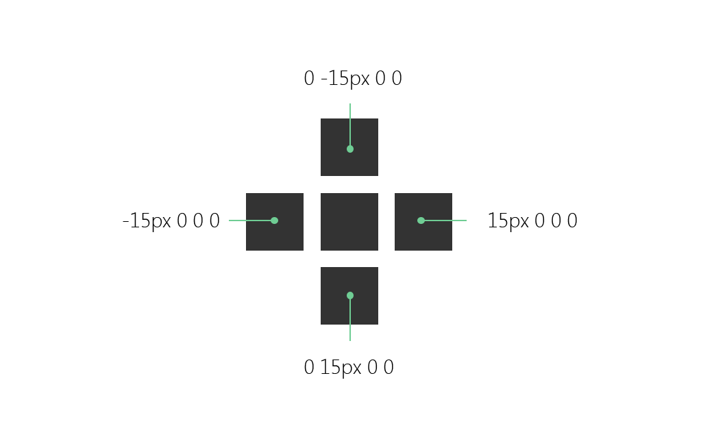 We removed the color value from box-shadow property since we have applied the color property at base element, so the box shadow property will inherit the color value from the color property, cool hah?
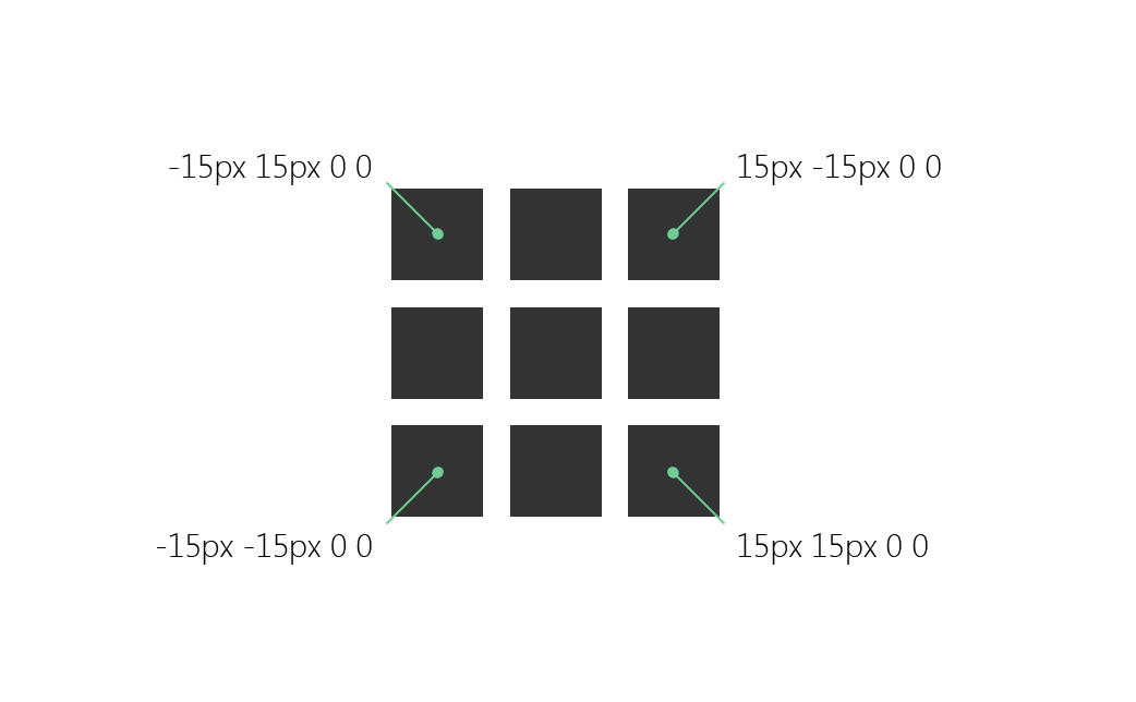
So far we created a "cross" with these extra boxes. We're applying an extra 5px to create a gap between our boxes. Let's complete the shape by adding the final boxes:
            .pixel-loader {
              width: 10px;
              height: 10px;
              background: #333;
              color: #333;
              box-shadow: 0 15px 0 0,
                                  15px 0 0 0,
                                  -15px 0 0 0,
                                  0 -15px 0 0,
                                  15px 15px 0 0,
                                  -15px -15px 0 0,
                                  15px -15px 0 0,
                                  -15px 15px 0 0;
            }
The animation
The animation we're planning to integrate it's a combination of boxes movement and a smooth color transition.
At first we will create the keyframe:
            @keyframes anim {
              33% {
                box-shadow: 20px 20px 0 0,
                                    -20px -20px 0 0,
                                    20px -20px 0 0,
                                    -20px 20px 0 0,
                                    0 10px 0 0,
                                    10px 0 0 0,
                                    -10px 0 0 0,
                                    0 -10px 0 0;
              }

              66% {
                box-shadow: 20px 20px 0 0,
                                    -20px -20px 0 0,
                                    20px -20px 0 0,
                                    -20px 20px 0 0,
                                    0 10px 0 0,
                                    10px 0 0 0,
                                    -10px 0 0 0,
                                    0 -10px 0 0;
              }
            }
This is what we achieved so far:
See the Pen gaoBOa by Vangel Tzo (@srekoble) on CodePen.
The next step is to apply the color transition with filter property. We need to change the value of hue-rotate from 0deg to 360deg.
            @keyframes anim {
              0% {
                filter: hue-rotate(0deg);
              }

              33% {
                box-shadow: 20px 20px 0 0,
                                    -20px -20px 0 0,
                                    20px -20px 0 0,
                                    -20px 20px 0 0,
                                    0 10px 0 0,
                                    10px 0 0 0,
                                    -10px 0 0 0,
                                    0 -10px 0 0;
              }

              66% {
                box-shadow: 20px 20px 0 0,
                                    -20px -20px 0 0,
                                    20px -20px 0 0,
                                    -20px 20px 0 0,
                                    0 10px 0 0,
                                    10px 0 0 0,
                                    -10px 0 0 0,
                                    0 -10px 0 0;
              }

              100% {
                filter: hue-rotate(360deg);
              }
            }
Look at the following example with different base colors
See the Pen QjaZjg by Vangel Tzo (@srekoble) on CodePen.
This is it! Let's add an extra spinning effect for our cube and it's ready.
            .pixel-loader {
              width: 10px;
              height: 10px;
              background: #f35626;
              color: #f35626;
              box-shadow: 0 15px 0 0,
                                  15px 0 0 0,
                                  -15px 0 0 0,
                                  0 -15px 0 0,
                                  15px 15px 0 0,
                                  -15px -15px 0 0,
                                  15px -15px 0 0,
                                  -15px 15px 0 0;
              animation: anim 2s linear infinite;
            }

            // Animation keyframe

            @keyframes anim {
              0% {
                filter: hue-rotate(0deg);
              }

              33% {
                box-shadow: 20px 20px 0 0,
                                    -20px -20px 0 0,
                                    20px -20px 0 0,
                                    -20px 20px 0 0,
                                    0 10px 0 0,
                                    10px 0 0 0,
                                    -10px 0 0 0,
                                    0 -10px 0 0;
              }

              66% {
                box-shadow: 20px 20px 0 0,
                                    -20px -20px 0 0,
                                    20px -20px 0 0,
                                    -20px 20px 0 0,
                                    0 10px 0 0,
                                    10px 0 0 0,
                                    -10px 0 0 0,
                                    0 -10px 0 0;
              }

              100% {
                filter: hue-rotate(360deg);
                transform: rotate(360deg);
              }
            }
See the Pen WQZMzY by Vangel Tzo (@srekoble) on CodePen.
The needed prefixes as always are missing, just add them accordingly.
Hope you enjoy! Cheers
Tweet