Some months ago I participated for fun at Awwwards conference competition. Awwwards conference will take place at 24-25 February in Barcelona. They created a beautiful site to promote this event which caught my attention from the first moment. One of the reasons I like it so much, apart from the elegant design and the intresting speakers, was the impressive animations at the intro section. And then the magic phrase 'Are you a code artist?' An artist no an enthusiast oh yes! So I created the following animation effect that I'll explain to you right away.
First let's have a look at the animation here.
Nothing too complicated or too hard to understand here, just some little tricks and a lot of sass magic.
Let's create some circles
First of all thιs idea was influenced by a magnificent codepen by lukerichardville. My approach although was much more simpler.
So the markup for this animation was a verbose list with 11 empty list options. Each of them represent a circle.
            <ul>
              <li></li>
              <li></li>
              <li></li>
              <li></li>
              <li></li>
              <li></li>
              <li></li>
              <li></li>
              <li></li>
              <li></li>
              <li></li>
            </ul>
Let's create the first circle
            body {
              background: #1c1c1c;
              overflow: hidden;
            }

            li {
              list-style: none;
              box-shadow: inset 1px 1px 40px #19a598;
              background: #1c1c1c;
              border-radius: 50%;
              position: absolute;
              top: 50%;
              left: 50%;
              width: 30px;
              height: 30px;
            }
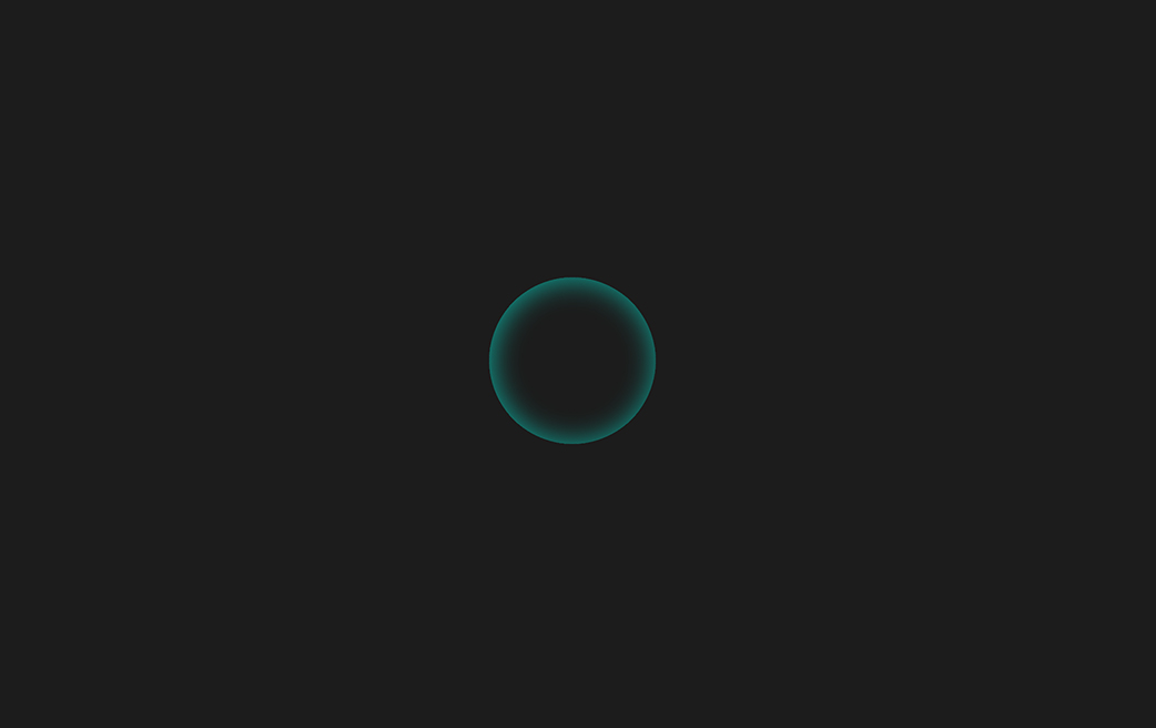
The result should be

Our circles are positioned absolute (so each li stack upon each other so far) with a 30px width & height and an inset box-shadow to colorize the circles.
The next step is to give different dimensions to each circle. Since we don't want to do this manually for 11 elements we are going to use the SASS loop function @for.
            @for $i from 1 through 12 {

              $width: 30px * $i;
              $height: 30px * $i;

              li:nth-child(#{$i}) {
                width: $width;
                height: $height;
              }
            }
So what we accomplish so far is to separate those circles. Our goal is to create a depth so we have to differentiate the position of each circle. We can achieve that by moving each circle from the top and left via margins and set the biggest circle at the bottom of the stack order.
            @for $i from 1 through 12 {

              $width: 30px * $i;
              $height: 30px * $i;

              li:nth-child(#{$i}) {
                width: $width;
                height: $height;
                z-index: -$i;
                margin-top: - ($width / 2);
                margin-left: ($height / 6);
              }
            }
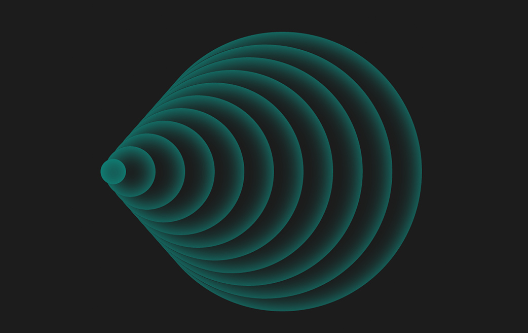
This is what we accomplished so far

What need to do now is to rotate the ul list via rotate 3d into Y axis. We are going to use transform: rotate3d(0, 1, 0, 45deg) property.
To perfectly center this animation we are using a wrapper class outside ul, and we center it via vertical and horizontal trick that we mentioned in a previous blog.Animate the universe
To complete our animation effect guess what, we need to apply an animation ^^. Let's have a look at the animation bellow.
            @for $i from 1 through 12 {

              $width: 30px * $i;
              $height: 30px * $i;
              $var: $i/5;

              li:nth-child(#{$i}) {
                width: $width;
                height: $height;
                z-index: -$i;
                margin-top: - ($width / 2);
                margin-left: ($height / 6);
                animation: spin 2s #{$var}s infinite;
              }
            }

            @keyframes spin {
              0%    { transform: rotate(0deg) scale(1); }
              50%   { transform: rotate(360deg) scale(2); }
              100% { transform: rotate(0deg) scale(1); }
            }
We applying an infinite animation with an animation delay for each circle to create these sequences of waves. Our animation consist of a full rotate of 360deg and a scale from 1 to 2. Let's sum up.
HTML
            <div class="wrap">
              <ul>
                <li></li>
                <li></li>
                ...
              </ul>
            </div>
SCSS
            body {
              background: #1c1c1c;
              overflow: hidden;
            }

            .wrap {
              position: absolute;
              top: 50%;
              left: 50%;
              transform: translate(-50%, -50%);
            }

            ul {
              transform: rotate3d(0, 1, 0, 45deg);
            }

            li {
              list-style: none;
              box-shadow: inset 1px 1px 40px #19a598;
              background: #1c1c1c;
              border-radius: 50%;
              position: absolute;
              top: 50%;
              left: 50%;
              width: 30px;
              height: 30px;
            }

            @for $i from 1 through 12 {
              $width: 30px * $i;
              $height: 30px * $i;
              $var: $i/5;

              li:nth-child(#{$i}) {
                width: $width;
                height: $height;
                z-index: -$i;
                margin-top: - ($width / 2);
                margin-left: ($height / 6);
                animation: spin 2s #{$var}s infinite;
              }
            }

            @keyframes spin {
              0%    { transform: rotate(0deg) scale(1); }
              50%   { transform: rotate(360deg) scale(2); }
              100% { transform: rotate(0deg) scale(1); }
            }
You can watch the animation in action in the following pen, enjoy!
See the Pen A looped animation expiriment by Vangel Tzo (@srekoble) on CodePen.